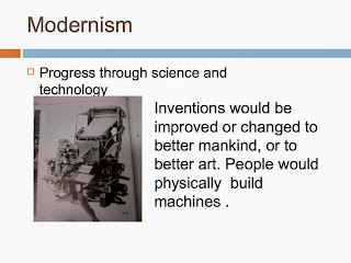
Excercise 1
 This 1991
This 1991
This 1991
This 1991
Fig. 1.1
 Fig. 1.2

This one’s for the fridge
This one’s for the fridge
This one’s for the fridge

Fig. 1.3

Fig. 1.4
Fig. 1.5
Fig. 1.6


This
is a formal analysis of how to Swiss products relate to the
international typographic style and design through the choice of the first five logos(Fig. 1.1 - Fig. 1.5).
The office Of Institutional Research logo uses grid structures that was first
used in schools that adopted the international typographic style. The shapes used in the logo shows evidence of the use of law of proximity. This is when two
objects are grouped together to be seen as a whole. There is also
clear evidence of visual hierarchy. The more important letters, for
example: the name is much larger then the labels and description of the logo. This is also shown in the volume studio logo that usses the method of reading from top to bottom and
left to right. I't doesn't matter on which side you begin reading,
the information is grouped in sections. This is called the law of
closure, where objects (in this case the typographic and geometric layout) is
grouped together in sections to be seen as a whole.
the Department of Transport USA logo design uses law of proximity and figure ground
principles. The logo in the middle of the typography is represented as a silhouette, (in
this case a star circle) and negative space to create a different image
The lines used to create the logo are grouped together to create
another visual aspect of a whole. This is the principle of applying
the laws of closure to the design. The letters or name
(abbreviations) of the logo is set closer together to form unity.
This allows the viewer to analyze that all the visual imagery, along
with the typography belong together or fit together as a whole.
Thus
I conclude that Gestalt principles can be found in everyday design
products whether it be Swedish or not. Class excercises
POST MODERNISM/MODERNISM
Post
Modernism and its influences
Post
Modernism and its influences include how futurists tried to depict
their future in terms of technology and the pass they wanted to
develop technology. This lead to social differences, which brought
forward things like alienation between races and other cultural
relations. this also brought forward a divide and struggle for power.
Feminism
is the description of the role of women in society. because of how
women were seen and classed in the years before the 1990's, women
started to becoming depended on themselves and grew self conscious.
The group named blooms berry are established in the 1920's, the
reason for their establishment was to empower women in society and
women's rights.
An
interesting word i learned was Psycogeography. This is the study of
how your psyche interacts within your environment or experiences.


Benetton is a company that a company a branding approach that is being used by many
fashion giants, including retailers like Zara, Uniqlo and H&M.
Benneton's approach to marketing is to rely on a network of young people to map trends, this reflects their
desire to be associated with the social issues of the day. They use shock tactics with its 'Unhate' campaign, which provoked the Vatican's
anger by using an image of Pope Benedict XVI kissing Imam Sheikh Ahmed
el-Tayeb. US president Barack Obama was also on the receiving end of the
Unhate treatment. (Chapman M. 2012. Benetton's Gianluca Pastore on emulating the brand's glory days. http://www.marketingmagazine.co.uk/article/1143418/benettons-gianluca-pastore-emulating-brands-glory-days)
My thought on Benneton advertising
Benneton's approach to branding their products is to address society problems in order to unite differences within people. This is done by trying to connect or relate similarities within people and beliefs. They try to change people through uniting them through a method where everyone can relate to one another with feeling and same society problems.
Their designs appeal to me as a designer because of the philosophy behind their belief or marketing structure. In my designs i try to portray negative imagery or symbols in a positive manner. We are united ans we all have walked through and in darkness. I believe that this philosophy appeals to me as designer because the way i try to make people relate to that darkness and not see it as a bad situation or feeling but one that you can relate to and talk about openly because we are all human, even though we live different lives we can relate and share the same pain. This is something i try to portray in my designs and it is what Benetton is trying to throw out into the world.
I'f i was the manager of the Benetton cooperation i will not change anything because some people are sensitive. We should not throw certain issues into the dark and not address these issues, because they will always be there and somehow all that pressure that is thrown into the darkness will overflow into the light.
Thus i conclude that showing the truth is a symbol of living ones life to the fullest even if that truth makes others uneasy, no one is special. Everyone bleeds when they are cut.
Exercise 4
This was primarary in the form of a power-point presentation
Images sourced from Megg's History of Graphic Design
Group members


Excercise 5
5.1.


Green Shack features at Design Indaba 2013
This shack is an exploration of light. Some of the creators Andrew Lord and Justin White wanted to demonstrate that corrugated iron and timber need not represent poverty and oppression. The Green Shack looks at how simple, low-tech design can transform temporary spaces into home comfort spaces. The problem being pinpointed is that people who live in shacks live within dangerous spaces which leads to many shack fires and shack owners sometimes experience floods. This shack wants the viewer to experience a safer means of building safer shelters and saving trees as nature is influenced from fire outbreaks. This is an attempt to teach the people ans masses. (The design indaba. 2013. http://www.designindaba.com/news/green-shack-design-indaba-2013)
I think this was a cool idea of promoting safety and staying green. This in actual fact may be the most cleanest shack i have ever seen even though i only saw them in images.
5.2.

The spear depicts the current (2013) South African president, which exposes his manhood parts. This was an art piece that many people saw differently or interpretative in their own manner.
I loved this painting. To me it seemed appealing for me. When i look at the image i see a man that fears nothing. A suiting role for a person who acts the part. It's a shame it was destroyed. Some people do not understand art for they are judging the artist and i feel judging everyone and everything that is art.
This paintings depicts the arrogance or methods and attitudes of the current ruling party. ANC supporters were the ones that ended up vandalizing the painting by throwing black paint over it seeing it as discriminating.
5.3.


This 1991
This 1991
This 1991
This 1991
This 1991
This 1991
This 1991


‘technocentrism’ of postmodernity by Inge Konik
In this article Inge konik critiques a film Sonzero’s Pulse (2006). The main focus is the context or content of the film. The main focus of the critique is the context of postmodernity that courses the spread of capitalism, which ends up in the development of technoscience through the cinematic medium. The extend of the article focusses on how these terms that relate to one another or their relevance of context in how the film portrays itself and effects social bonds in the real world. It also discusses the difference between Modernism and Post-modernism and states that modernistic ideals cannot survive in a Post modern era. It states that the film uses the approach from an uncritical perspective, thus confusing the audience through what is reality or fiction. The article stresses that the film has a highly negative effect on the audience, mainly the effect of human social bonds.
Visual culture and lifestyle in the digital age
Virtual reality can be divided into:


I'm not as educated, sir, as thee,
But God Almighty's sun I see,
And you may treat me very hard l'or this,
But I His Holy Hand shall kiss.
I have no nation, none as great as yours
That kills and grabs beyond the stores;
I have no selfish laws to keep men down
And then upon them ever frown.
You have the wealth of land and sea and sky,
You boast as if you'd never die:
How great you are, my mighty earthly king,
So great that I must tribute bring!
But, sir, one day you'll surely be in Hell,
And then a story I will tell;
As Dives asked for quenching water then,
So will you all from that hot pit.
Your gilded pride is much in this your day
It's time for you to gather bay
And so you feed upon my sorry life,
And rob me of my home and wife.
My lands you say are yours, and minerals too,
How sweet it is, dear sir, to you!
You kick me down and lash me on my back,
And when I cry there's one more whack.
But one good day will surely come for me,
When God of men will speak to thee,
And then the awful thunder clap will tell,
How far down you will be in Hell.
(http://www.marcusgarvey.com/pages/A_Black_Man%27s_Speech_To_A_White_Man_In_America)
Back to Africa movement
The Back to Africa movement was a developed to inspire African Americans to return back to Africa during the 9th and 20th centuries. Marcus Garvey believed that all black people all over the world should unite in order to form their own government in their native land, in Africa. This was the purpose of the UNIA, to promote Black Nationalism, or an “independent African nationality". It was his believe that all Africans would create and build a nation that honors and uplifts African heritage and ideals to enjoy enjoy economic, social or political freedom. Thus he promoted unity and racial pride for all Africans under oppression. (Black Nationalism and the “Back to Africa” Movement. http://badcursive.wordpress.com/2013/06/04/black-nationalism-and-the-back-to-africa-movement/)

Kwame Nkrumah
Nelson Mandela
Julius Nyerere
Leopold Sedar Senghor
Henrietta Vinton Davis
Martin Luther King Jr
Alhaji Ahmed Sekou Toure
Fela Anikulapo Kuti
Amy Jacques Garvey
Jomo Kenyatta
M. L. T. De Mena
Paul Robeson
Malcolm X
Steve Biko
Kwame Ture (Stokely Carmichael)
Patrice Lumumba
Frantz Fanon
The
International Typography Style.
Class exercises
Chapter 19 – The New York School
Chapter 19 – The New York School
SUMMARY
European
immigrants who had fled the political climate of totalitarianism in
Europe introduced modern design in
America
during the 1940s.
An original
American
approach
to modernist design gained
international prominence in the 1950s
and continued as a dominant force in graphic design until the 1970s.
This introduced an egalitarian
society with capitalist values, which limited artistic
traditions before
World
War
II. A diverse
ethnic heritage engendered an original approach
to
American
modernist design. European designs were theoretical and highly
structured,
American
design was
pragmatic, intuitive,
and less formal in its approach
to organizing
space.Novelty
of technique
and originality of concept were much
prized
in this highly competitive
society,
and designers
sought to solve communications problems while satisfying a need for
personal
expression.
Modern
design introduced American designers like Paul
Rand
who understood the modern movement,
especially the works of Paul
Klee,
Wassily
Kandinsky,
and the cubists. New
York
City attracted
him and other talented individuals
and by the middle of the twentieth century.
Other Pioneers of the New-York school are Alvin
Lustig,
Alex
Steinweiss,
George
Tscherny,
Brad- bury
Thompson,
Saul
Bass. Three partners in the New
York
design office
of Brownjohn, Chermayeff,
and Geismar: Robert
Brownjohn, Ivan Chermayeff,
and
Tom
Geismar.
Rand’s
strength was
in his ability to analyze
a message, reduce it to a symbolic essence, and communicate the
message through dynamic visual form. Work that illustrated his style
can be found in works like the barbed wire on the 1940
cover
of Direc- tion magazine.
He applied his design approach
to advertising
at the
Weintraub
agency
from 1941
until 1954.
Thsis is where he collaborated with copywriter Bill Bernbach
became a prototype for the art/copy
team that worked
closely together to createa synergistic visual/verbal solution. Their
work presented visual puns and wordplay supported
by Rand’s
whimsical integration of photography,
drawing, and logo, asin the Ohrbach’s
campaign. After he left the agency he became an independent designer
and launched a book called Thoughts on Design. A book that inspired
generation of designers.
Alvin
Lustig applied his design methodology to album covers
and book and jacket
designs for New Directions in New
York.He
incorporated symbols that captured the essence of the contents, as on
the cover
for 27
Wagons
Full
of Cotton
by
Tennessee
Williams.
Tscherny
possessed an ability to capture the essence of the subject and
express it in simple terms that were elegant,
to the point, and disarmingly simple.His visual vocabulary
consisted of a variety of techniques,
including type, photography,
calligraphic brush drawing, and bold, simple shapes cut from colored
paper.
Regardless
of technique,
his process of reducing complex content to an elemental graphic
symbol remained constant.
Bradbury
Thompson
was
one of the most influential graphic designers
in postwar
America.
His designs for
Westvaco
Inspirations demonstrated a thorough knowledge of printing and
typesetting.
This included works that combine typography in forms like halftone
screen and four-color
process plates, were design elements in his visual vocabulary.
Thompson turned increasingly to a classical approach
to book and editorial design, focusing on readability,
formal harmony,
and the use of old style typeface during the 1960s
and 1970s.
Saul
Bass brought the New York School to Los Angeles in 1950. He was
influenced by Rand’s use of shape and asymmetrical balance, but
used single dominant images in his designs. Bass had a remarkable
ability to reduce mes- sages to powerful, simple pictographic images,
which enabled viewers to interpret content immediately.These forms
were often cut from paper with scissors or drawn freely with a brush.
He created the first comprehensive design program unifying print and
media graphics for a film. Examples from this can be seen in a short
film named Why Man Creates.
The
initial contribution of Brownjohn, Chermayeff,
and Geismar to
American
graphic design formed from a vas understanding of European designs.
At this time designs adhered to the client and design problems were
character-
ized
by inventive
and symbolic manipulation of imagery and forms, including letterforms
and typography.In
1960,
Brownjohn left
the partnership
and moved
to Eng- land, where he made significant contributions to British
graphic design, especially in the area of film titles, such
as the motion picture Goldfinger.
The firm changed
its name to Chermayeff
& Geismar
Associates
and played a
major role in the development of corporate identity.
Many
of the pioneers
of the New
York
School
mentioned here were either guest lecturers
or served on the faculty of
Yale
University’s
graphic design program under the direction of
Alvin
Eisenman and later Sheila de Brette-
ville the current
director.
This programme contributed
to the advancement of graphic design and design education throughout
the world.
Editorial
design in
America
was
advanced during the1940s
by Fortune,
Vogue,
and Harper’s
Bazaar.
The Fortune magazine developed a unique identity because of the
innovative
use of photography
under the direction of Leo
Lionni In 1949.Alexander
Liberman replaced Dr.
Agha
in 1949
as the art
director of
Vogue.At
Harper’s
Bazaar,
Alexey
Brodovitch
continued as the art
director until his retirement in 1958.
Pineles was
the first
female to become a member of the New York
Art
Director’s
Club. Henry
Wolf
became
the art
director of Esquire in 1953,
and redesigned the magazine’s
format, placing greater emphasis on white space and large
photographs. He used ypography
and imple- mented his vision of the cover.
This was done through conveying a simple image as a strong visual
idea. This can be seen in his works like “the
Americanization
of
Paris”—which
was
signified by a packet
of
“instant
red wine,”
satirizing the spread of
American
technology,
customs, and conveniences.
In
the late 1960s,
factors
including television, public con- cerns over
the
Vietnam
War,
environmental
problems,
and
the rights of minorities and women produced a need for a wider
variety and different
types of magazines.
New smaller magazines were developed like the New York Magazine.
This was a magazines for Print and Communications Arts for artists.
Among the editorial art
directors
who helped shape the viewpoints and philosophies of these
publications were Dugald
Stermer at Ramparts,
Bea Feitler
at Ms. More examples are Rolling stone(a rock and roll magazine)
classical
Times
Roman
typography
set in two columns per page, and full-page illustrations or
photography.
The
ad agency Doyle Dane Bernbach
ushered in the era of
“the
new advertising.”
For each campaign they explore the varies strategies in advertising,
this includes the advantages and disadvantages. Bill Bernbach
and his colleagues evolved
a visual/verbal syntax through which
word and image were fused into a conceptual expression of an idea so
that they become completely interdependent—like
“think
small” and the image of the
Volkswagen
beetle.
Typographic
trends in the 1950s
and 1960s
brought new approaches
to graphic design. Gene Frederico
spear-
headed figurative
typography.
This is when typography became images, such
as the wheels in Frederico’s
ad for
Woman’s
Day.
n
Don Egensteiner’s
“Tonnage”
advertisement,
for example, the word tonnage takes
on a connotative
meaning as it crashes down into the text below,
and the rotated type takes
advantage of reading patterns
to reinforce the top-to-bottom
flow toward
the body copy.
Another
typographic trend that began
inthe 1950s
was
a renewed interest in nineteenth-century decorative
and novelty
typefaces, which
had been rejected due to the influence of the modern art
movement.
in 1936
when the firm Photolettering
was
established photographic paper
became
commercially viable in the United States. A major advantage to
phototypography
was
the reduced cost of producing new typefaces. During the 1960s,
the expansion
of phototypography
was
accompanied by new designs and reissues of old designs, including
Victorian
faces,
The
new technology
brought about a proliferation of type designs that rivaled
the increased production of the
Victorian
era.
Herb
Lubalin defined the aesthetic potential of phototypography.
He ooked
at characters
of the alphabet as a means of giving
visual form to a concept or a message. ubalin explored the creative
potential of type through “typograms,”
. This term means visual typographic poems in which
concept and visual form merge. An example is his work is the
“Mother
and Child” logo, in which
the ampersand
enfolds and protects the child
in a visual metaphor for motherly love.He
also explored through techniques like letter
spacing, word spacing, and leading; condens- ing, expanding,
touching,
and overlapping
characters;
and enlarging and reducing type to extreme scales.Lubalin also made
significant contributions to editorial design through his work for
the Saturday
Evening Post,
Eros,
Avant
Garde, and U&lc.
Avant
Garde, a lavishly vi- sual periodical that published visual essays,
fiction, and reportage,
was
one of Lubalin’s
most innovative
achieve-
ments.
The
logotype he designed for this magazine
was
developed into a family of sans-serif typefaces under the same name.
In
1970
Lubalin, phototypography
pioneer Edward
Rondthaler,
and typographer
Aaron
Burns founded International
Typeface
Corporation (ITC) and began
to publish a tabloid-size
journal, U&lc, designed by Lubalin, to demonstrate and publicize
ITC typefaces. Lubalin saw the designer’s
role as projecting a message from a surface using three
interdependent means of expression: photography,
illustration, and letterforms.
The complex and dynamic design style of U&lc had a major impact
on typographic design of the 1970s.
The
works of graphic designers
Ernie Smith and
Alan
Peckolick
and lettering
artists
Tony
DiSpigna and
Tom
Carnase share similarities with Lubalin’s
work while achieving
original solutions to a diverse
range of problems.
George
Lois
worked
at Doyle Dane Bernbach
during the late 1950s,
adopted the Bernbach
philosophythat
fully integrated visual/verbal concepts were vital to successfully
conveying
a message. His designs are deceptively
simple and direct, such
as the Esquire maga-
zine cover
in which
Muhammad
Ali.
Ali was
stripped of his world heavyweight championship
title because he was
a conscientious objector and refused military service, posed as Saint
Sebastian(a
famous religious man
who was
condemned by Roman
Emperor Diocle- tian and shot by arrows).
The
powerful image combined with a simple line of type,
“The
Passion
of Muhammad
Ali,”
captures the reader.
Excercise 2
This is a small thought on the layout and content use of the magazine one small seed
Excercise 2
This is a small thought on the layout and content use of the magazine one small seed


It is evident that this magazine uses a chic style in image content and still uses international typographic style and design through the use of the GESTALT principles. The layout stays consistent in layout hierarchy but uses imagery to draw in the audience.
I like the dark color tones especially the dark shades. It is clear they use contrast to draw attention to a specific area.
These advertisements use structure for their layouts. For example a visual hierarchy of structuring information. The evidence of grid structure is clear in all four images. As always the typeset seem to be the focus points even thou the pages consist of images with high contrats.
Exercise 3
The contemporary brand that I as a designer admire is the united front of Benetton design campains.
The united colors of Benetton
The Benetton family is a sleeping giant of the fashion industry.

"These days, upstart brands such as Zara and H&M are stealing the
headlines - and the allegiance of many younger shoppers - as they storm
the world from Moscow to Manila. But Benetton, which had sales last year
of about [US]$3 billion, hasn't gone away," writes Peter Gumbel in a
prescient 2009 article published in Time magazine. "(Iboni J. 2012. United colors of Cool. http://www.thegenteel.com/articles/business/united-colours-of-cool)
My thought on Benneton advertising
Benneton's approach to branding their products is to address society problems in order to unite differences within people. This is done by trying to connect or relate similarities within people and beliefs. They try to change people through uniting them through a method where everyone can relate to one another with feeling and same society problems.
Their designs appeal to me as a designer because of the philosophy behind their belief or marketing structure. In my designs i try to portray negative imagery or symbols in a positive manner. We are united ans we all have walked through and in darkness. I believe that this philosophy appeals to me as designer because the way i try to make people relate to that darkness and not see it as a bad situation or feeling but one that you can relate to and talk about openly because we are all human, even though we live different lives we can relate and share the same pain. This is something i try to portray in my designs and it is what Benetton is trying to throw out into the world.
I'f i was the manager of the Benetton cooperation i will not change anything because some people are sensitive. We should not throw certain issues into the dark and not address these issues, because they will always be there and somehow all that pressure that is thrown into the darkness will overflow into the light.
Thus i conclude that showing the truth is a symbol of living ones life to the fullest even if that truth makes others uneasy, no one is special. Everyone bleeds when they are cut.
Exercise 4
This was primarary in the form of a power-point presentation
Images sourced from Megg's History of Graphic Design
Group members
Shaulin
Renier
Heino


Excercise 5
5.1.
Green Shack features at Design Indaba 2013
This shack is an exploration of light. Some of the creators Andrew Lord and Justin White wanted to demonstrate that corrugated iron and timber need not represent poverty and oppression. The Green Shack looks at how simple, low-tech design can transform temporary spaces into home comfort spaces. The problem being pinpointed is that people who live in shacks live within dangerous spaces which leads to many shack fires and shack owners sometimes experience floods. This shack wants the viewer to experience a safer means of building safer shelters and saving trees as nature is influenced from fire outbreaks. This is an attempt to teach the people ans masses. (The design indaba. 2013. http://www.designindaba.com/news/green-shack-design-indaba-2013)
I think this was a cool idea of promoting safety and staying green. This in actual fact may be the most cleanest shack i have ever seen even though i only saw them in images.
5.2.
The Spear
I loved this painting. To me it seemed appealing for me. When i look at the image i see a man that fears nothing. A suiting role for a person who acts the part. It's a shame it was destroyed. Some people do not understand art for they are judging the artist and i feel judging everyone and everything that is art.
This paintings depicts the arrogance or methods and attitudes of the current ruling party. ANC supporters were the ones that ended up vandalizing the painting by throwing black paint over it seeing it as discriminating.
5.3.
Save the Rhino: Nothing Will Ever Bring Them Back
This is a nothing will bring them back campaign as people keep killing rhinos that are inhabiting South Africa. Rhino poaching and the possible extinction of the species.The exhibition was entitled “nothing we do will ever bring them back” , this makes the audience
aware of the cause while the artificial rhino horn being strapped on to
other animals emphasizes this. Thus portraying that putting a rhino horn onto a another animal will not represent that animal as a rhino. (http://www.trendhunter.com/trends/save-the-rhino-campaign)
When i came across this i thought that even though there is strong meaning behind this ad, i thought that if it is relevant in a sense that would people listen to these cries or not. If it was me i would use children or a human figure. The use of human imagery and being slaughtered for the benefit of another would touch others hearts. The idea of a baby being slaughtered is a strong image to take in.
Exercise 6
Ebony and Ivory 1982
This one's for the Fridge 1991
This one’s for the fridge
This 1991
This one’s for the fridge
This 1991
This one’s for the fridge
This 1991
This one’s for the fridge
This 1991
This one’s for the fridge
This 1991
This one’s for the fridge
This 1991
This one’s for the fridge
This 1991
Oliviero Toscani, 1989
Oliviero Toscani 1993, Advertisement campaign, United colors of Benetton
Whoa, whoa, what's important 1993
Oliviero Toscani, 1994
Sentenced without words 1996
2000 Oliviero Toscani
2007
The Model as Muse 2009
The charm of the uniform 2013
Exercise 7
Table and keywords, compare the key elements of Modernism and Postmodernism.
Modernism
A. Master Narratives
B. Social and cultural unity
C. Master narrative of progress through science and technology
D. Sense of unified
E. Model of the
middle-class
F. Hierarchy
G. Faith and personal investment in big politics
H. Faith in "Depth"
I. Mass culture,
J. Art as unique object and finished work
K. Broadcast media
L. Determinacy
M. Sense of clear generic boundaries and wholeness
N. Clear dichotomy between organic and inorganic
O. Phallic ordering of sexual difference,
Post-modernism
A. counter-myths of origin
B. Social and cultural pluralism
C. Anti-technology reactions
D. Sense of fragmentation and decenter-ed self
E. alternatives to middle-class marriage
model
F. Subverted order,
G. Trust and investment in micro politics
H. Attention to play of surfaces, images
I. Misclassified culture
J. Art as process, performance, production, intersexuality.
K. Interactive
L. Indeterminacy,
M. Hybrid,
N. Cyborg mixing of organic and inorganic
O. Androgyny, queer sexual identities, polymorphous sexuality,
All keywords found at ( Irvine, M. http://www19.homepage.villanova.edu/karyn.hollis/prof_academic/Courses/2043_pop/modernism_vs_postmodernism.htm)
Exercise 8
Thematising the ugly side of sublime technological development:
Sonzero’s Pulse (2006) as an inadvertent critique of the‘technocentrism’ of postmodernity by Inge Konik
In this article Inge konik critiques a film Sonzero’s Pulse (2006). The main focus is the context or content of the film. The main focus of the critique is the context of postmodernity that courses the spread of capitalism, which ends up in the development of technoscience through the cinematic medium. The extend of the article focusses on how these terms that relate to one another or their relevance of context in how the film portrays itself and effects social bonds in the real world. It also discusses the difference between Modernism and Post-modernism and states that modernistic ideals cannot survive in a Post modern era. It states that the film uses the approach from an uncritical perspective, thus confusing the audience through what is reality or fiction. The article stresses that the film has a highly negative effect on the audience, mainly the effect of human social bonds.
Exercise 9
Global Village
The global village is the home to many different people or cultures that live together, these cultures include Russian, Japanese, Mandarin, Dutch, German, French, Portuguese, Afrikaans ect. (Mangrum, S. 2013. http://blog.burningman.com/2013/09/participate/the-global-village/)
Postmodernism
Post modernism embraces the period from about
1980 to the present. It can be characterized by the emergence of the postindustrial
information economy, replacing the previous classes of aristocracy, middle
class, and working class with the new paradigm with the hierarchical structure of information elite, middle
class, and underclass. The post modern era also questions past believes of order and restructures it into new so called modern notions such as feminism, multiculturalism, environmentalism, etc. Thus post modernism is the complete opposite of Modernism beliefs. (Hartman, P. What is "Postmodernism"?. http://www.naciente.com/essay15.htm)
Culture industry
"Cultural Industries are defined as those industries which produce
tangible or intangible artistic and creative outputs, and which have a
potential for wealth creation and income generation through the
exploitation of cultural assets and production of knowledge-based goods
and services (both traditional and contemporary). What cultural
industries have in common is that they all use creativity, cultural
knowledge, and intellectual property to produce products and services
with social and cultural meaning.The cultural industries include: advertising; architecture; crafts;
designer furniture; fashion clothing; film, video and other audiovisual
production; graphic design; educational and leisure software; live and
recorded music; performing arts and entertainment; television, radio and
internet broadcasting; visual arts and antiques; and writing and
publishing. The term “cultural industries” is almost interchangeable
with the concept of “creative industries.” Whereas the notion of
“cultural industries” emphasizes those industries whose inspiration
derives from heritage, traditional knowledge, and the artistic elements
of creativity, the notion of “creative industries” places emphasis on
the individual and his or her creativity, innovation, skill and talent
in the exploitation of intellectual property. The notion of ‘cultural
industries’ is also closely linked to but, again, slightly different
from a categorization based strictly on the notion of “intellectual
property,” which is closely linked to the concept of information-driven
economies, and which includes such activities as scientific and
technological innovation, software and database development,
telecommunication services, and the production of hardware and
electronic equipment."(Loy, A. 2009. What are Cultural Industries?. http://culturalentrepreneur.org/blog/what-are-cultural-industries/)
Virtual Reality – Interactive media
Virtual reality is a 3D simulation made through the use of software and electronics to create a virtual of non real wold, which is presented to the
user in such a way that the user suspends belief and accepts it as a real environment.
- The simulation of a real environment for training and education.
- The development of an imagined environment for a game or interactive story
Exercise 10
African Culture/Aesthetic
What is African Aesthetics?
One source explains African Aesthetics to be a way of appreciating nature. It is the way of evaluating nature and becoming one with it. Thus using it's raw materials and improving one's life. Thus creating stronger relationships with God, nature, spirit and ancestors. (Ozumba, G. http://www.academia.edu/568356/Outlines_of_African_Aesthetics)
European and American artists have acknowledged African art and artists for it's refreshing and simplified forms, but still do not understand the true meaning of these art works. The word aesthetic in African art is used to describe characteristics and elements of art work(this is all different types of African art works, not specified to one), this includes characteristics like the resemblance of sculptures to human beings and the luminosity or smoothness of objects or surfaces. (Belton, J. 2013. African Art and Aesthetics. http://www.yale.edu/ynhti/curriculum/units/1998/3/98.03.02.x.html)
Marcus Garvey – Back to Africa movement
Marcus Garvey (1887 - 1940) born in Jamaica and the founder of Rastafarian

Marcus Garvey was the leader of the Universal Negro Improvement Association (UNIA). He was the first African-American leader in American history to organize masses of people in a political movement. He migrated to America and became a Black Nationalist. His goals was to free Africa from the strong hold of European power and build a free and United Black Africa. This lead to him creating the Back-to-Africa Movement and organized a shipping company called the
Black Star Line which was part of his program to conduct international
trade between black Africans and the rest of the world and eventually return to Africa. Garvey built the largest mass movement of people of African descent in the United states (USA) history. (Biography Marcus Mosiah Garvey. http://www.marcusgarvey.com/pages/bio)
This is a speech from Marcus Garvey entitled
A Black Man's Speech To A White Man In America
I'm not as educated, sir, as thee,
But God Almighty's sun I see,
And you may treat me very hard l'or this,
But I His Holy Hand shall kiss.
I have no nation, none as great as yours
That kills and grabs beyond the stores;
I have no selfish laws to keep men down
And then upon them ever frown.
You have the wealth of land and sea and sky,
You boast as if you'd never die:
How great you are, my mighty earthly king,
So great that I must tribute bring!
But, sir, one day you'll surely be in Hell,
And then a story I will tell;
As Dives asked for quenching water then,
So will you all from that hot pit.
Your gilded pride is much in this your day
It's time for you to gather bay
And so you feed upon my sorry life,
And rob me of my home and wife.
My lands you say are yours, and minerals too,
How sweet it is, dear sir, to you!
You kick me down and lash me on my back,
And when I cry there's one more whack.
But one good day will surely come for me,
When God of men will speak to thee,
And then the awful thunder clap will tell,
How far down you will be in Hell.
(http://www.marcusgarvey.com/pages/A_Black_Man%27s_Speech_To_A_White_Man_In_America)
Back to Africa movement
The Back to Africa movement was a developed to inspire African Americans to return back to Africa during the 9th and 20th centuries. Marcus Garvey believed that all black people all over the world should unite in order to form their own government in their native land, in Africa. This was the purpose of the UNIA, to promote Black Nationalism, or an “independent African nationality". It was his believe that all Africans would create and build a nation that honors and uplifts African heritage and ideals to enjoy enjoy economic, social or political freedom. Thus he promoted unity and racial pride for all Africans under oppression. (Black Nationalism and the “Back to Africa” Movement. http://badcursive.wordpress.com/2013/06/04/black-nationalism-and-the-back-to-africa-movement/)
Marcus Garvey influences in non political means
He influence almost nearly all every prominent reggae songwriter, including Peter Tosh, Burning Spear, The Mighty Diamonds, Steel Pulse, Garnett Silk, Lucky Dube, and Culture. He is known to be the founder of Rastafarian.
Here is a partial list of some of the writers, leaders, and artists who have been influenced by Marcus Garvey:
Nelson Mandela
Julius Nyerere
Leopold Sedar Senghor
Henrietta Vinton Davis
Martin Luther King Jr
Alhaji Ahmed Sekou Toure
Fela Anikulapo Kuti
Amy Jacques Garvey
Jomo Kenyatta
M. L. T. De Mena
Paul Robeson
Malcolm X
Steve Biko
Kwame Ture (Stokely Carmichael)
Patrice Lumumba
Frantz Fanon
(Marcus Garvey's influences. http://geoffreyphilp.blogspot.com/2011/06/marcus-garveys-influence.html)
No comments:
Post a Comment